AS Event Planners
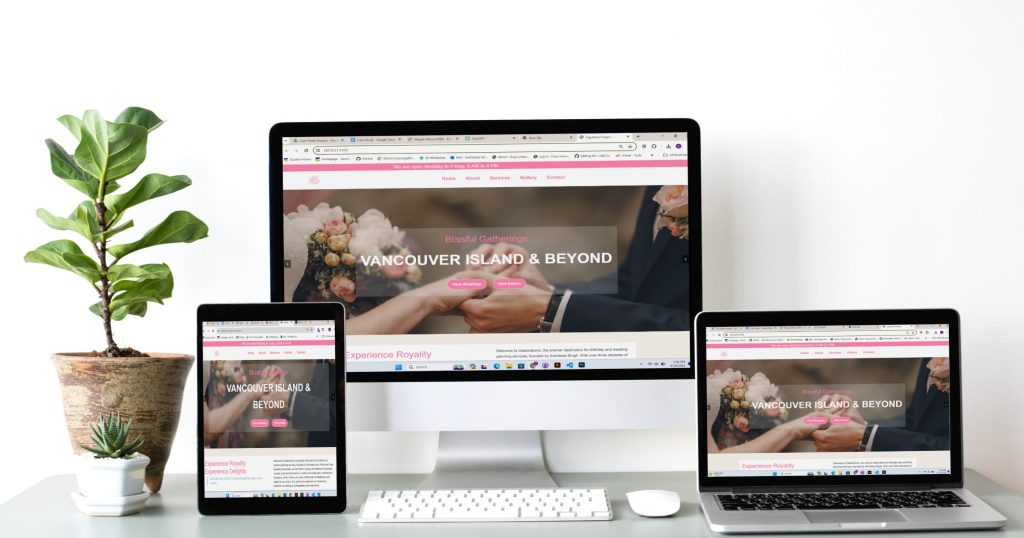
This project involved creating a brand identity and website for Arshdeep Singh, an event planner that owns a business that organises weddings and birthdays. The site includes sections that describe their services and a photo gallery showcasing their past events, allowing visitors to see the quality of their work. There’s also a contact form for easy communication with the business.
The website is mobile-friendly so that it looks good and works well on phones and tablets. The overall design is clean and modern, aimed at giving visitors a great first impression and helping the event planning business stand out in a competitive market.
From Code to Celebrations: The Tech Behind ASevent Planners Website
For the AS Event Planners website, I focused on creating a functional and visually appealing platform. I used HTML to structure the content, CSS for styling to make the website attractive, and JavaScript to add interactivity. My approach involved careful planning of the layout to ensure it was user-friendly, allowing visitors to easily navigate and find information about event planning services. Throughout the development process, my goal was to build a website that not only looks good but also provides a seamless experience for users looking to plan their events.
Moodboard
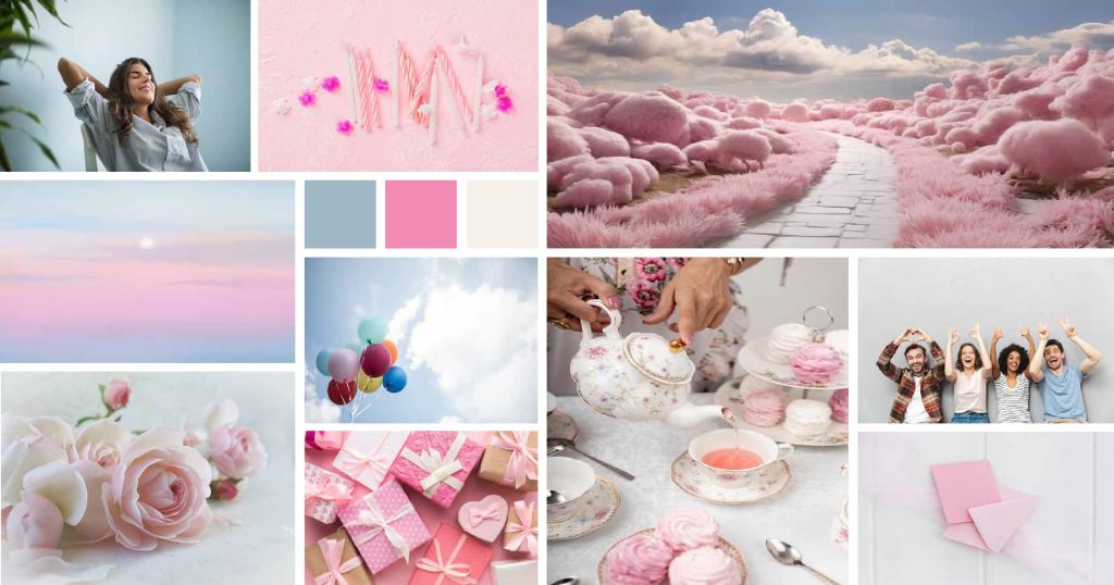
The first step I took was to create a mood board. I made a mood board that feels calm and happy. I used light pastel colours and pictures of skies, clouds, and soft pinks for a peaceful look. There are also images of balloons, candles, and celebrating people for a fun vibe. Elegant gifts and roses add a touch of class and romance, great for weddings or small events. This mood board is all about creating a gentle and joyful mood for special occasions.
Logo
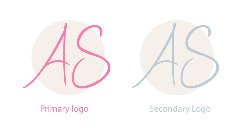
To create the logo,I started by drawing lots of sketches to figure out the best design. In the end, I picked these two: the main one is bright pink and really stands out, and the second one is grey and a bit quieter but still looks nice and modern.
Colours and Typography
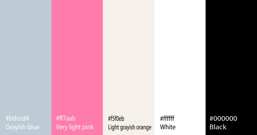
For the colours, I chose a palette that feels fresh and modern. The greyish blue is calm and professional, the bright pink pops and gives energy, the greyish orange is warm and welcoming, and the black and white keep things balanced and classic.
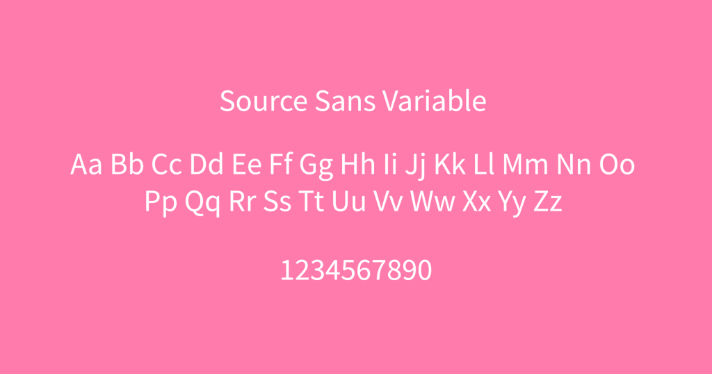
For the typography, I picked Source Sans Variable because it is clear and easy to read. It’s a versatile font that looks good on screens, and it works well for both big headlines and smaller text, making sure everything is legible and looks sharp.
Brand Collateral
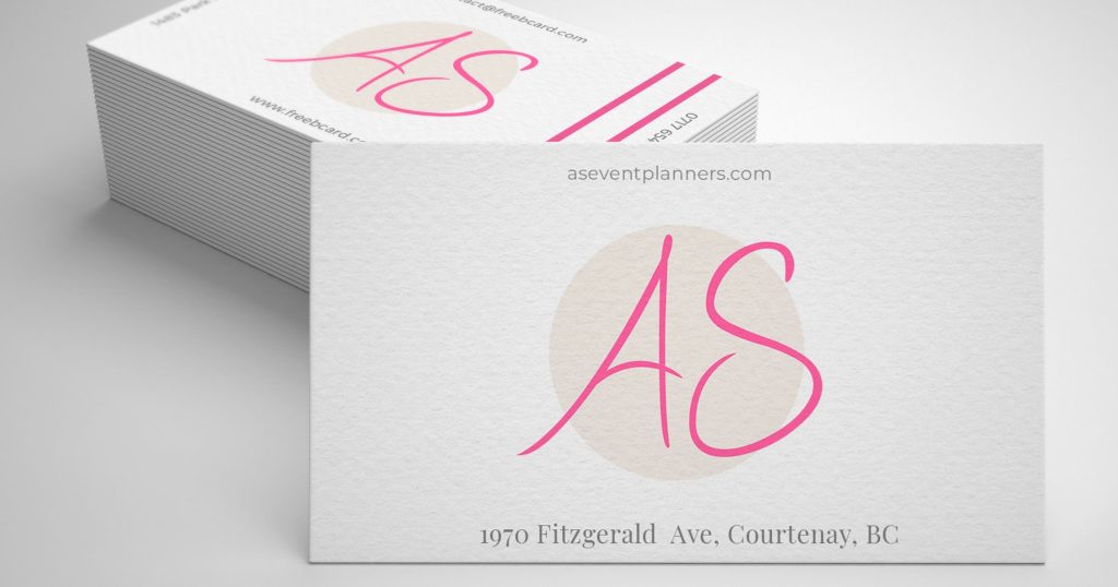
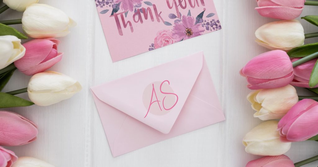
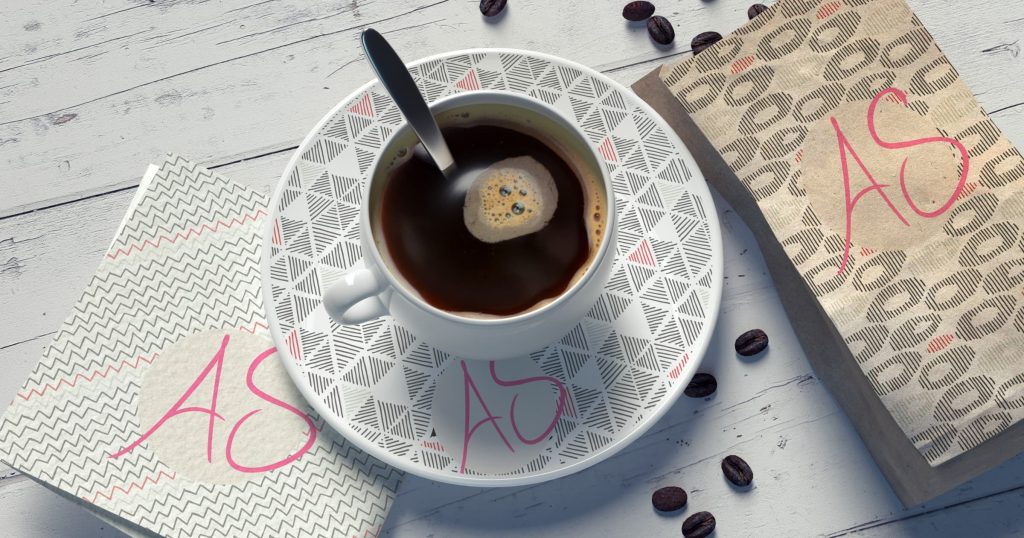
For the brand collateral of AS Event Planners, I crafted a series of branded items to create a cohesive visual identity. This includes business cards that carry the brand’s logo and aesthetic, elegant gift boxes that reflect the brand’s commitment to detail and quality, sophisticated invitation cards with matching envelopes to set the tone for the events, and custom-designed napkins and plates that enhance the overall event experience with a touch of the brand’s elegance.

Landing Page
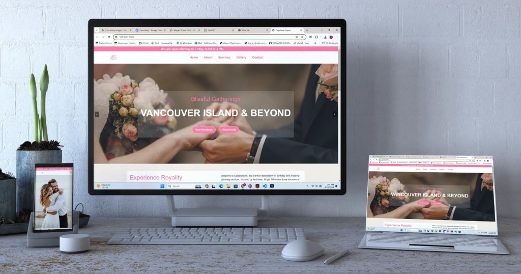
I made the AS Event Planners website responsive. This means it changes its layout to fit the screen, whether it’s viewed on a phone, tablet, or computer. It ensures the website is easy to use on any device.
