Backbacker’s Brewery
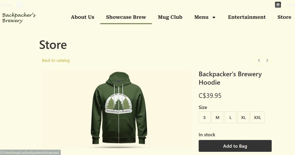
Robert Smith, the owner of Backpacker’s Brewery needs branding and a website for his new business. Backpacker’s Brewery is a fictitious brewery and restaurant in Port Alberni, BC that aims to provide its customers with a distinctive experience that combines craft beer with delicious food. Robert had 3 requirements for the website – Promote his newly designed brand with an online presence, sell brand merchandise using an online store, and promote weekly events that are held inside the restaurant.
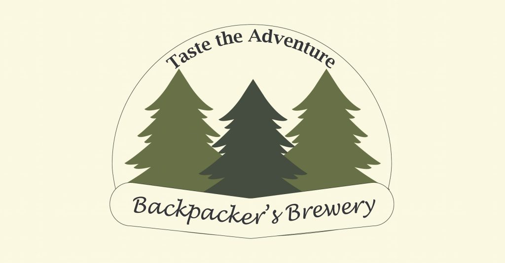
Primary Logo
When it came to designing the logo, I wanted to reinforce the brand’s connection to the outdoors and the natural world. By incorporating trees into the branding, Backpacker’s Brewery can create a unique visual identity that sets it apart from other breweries and reinforces its association with outdoor adventure and nature. The trees also symbolize Backpacker’s Brewery’s commitment to sustainability, adventure, and the spirit of exploration that defines both backpacking and brewing.
Colour Palette and Typography
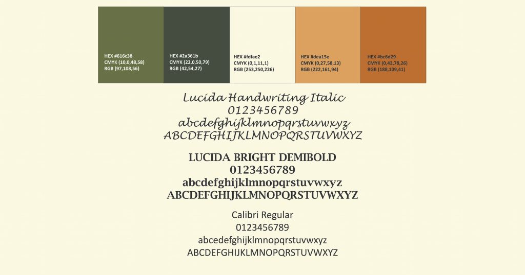
For the color palette, I used earthy tones to align the brand with the outdoor adventure and nature-loving ethos often associated with backpacking. This will help to establish a strong connection with the brand’s target audience of outdoor enthusiasts and craft beer lovers, while also communicating important values such as authenticity, sustainability, and adventure.
Lucinda Handwriting Italic was chosen as the typeface for the Backpacker’s brewery because its style can evoke a sense of authenticity and connection. For me, it suggests a down-to-earth, rustic charm that can resonate with outdoor enthusiasts, and it creates a casual, friendly atmosphere.
I used Lucida Bright Semibold for the slogan heading because of its legibility, even in smaller sizes. This ensured that the slogan heading remained legible and clear, whether displayed on signage, merchandise, or digital platforms.
Last, I picked Roboto Serif as the type font for Backpacker’s Brewery. Its digital compatibility ensures a balance between readability, and quality, for the brand’s visual identity.
Assets
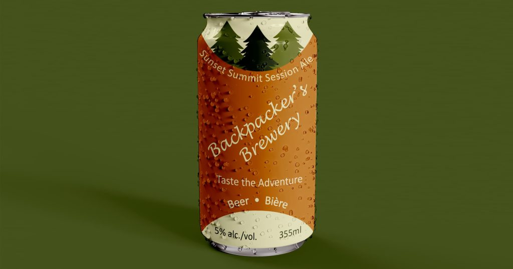
I created five specialty beer brews for Backpacker’s Brewery, with names that combined backpacking with beer. I designed the cans using the Backpacker’s logo and color palette.
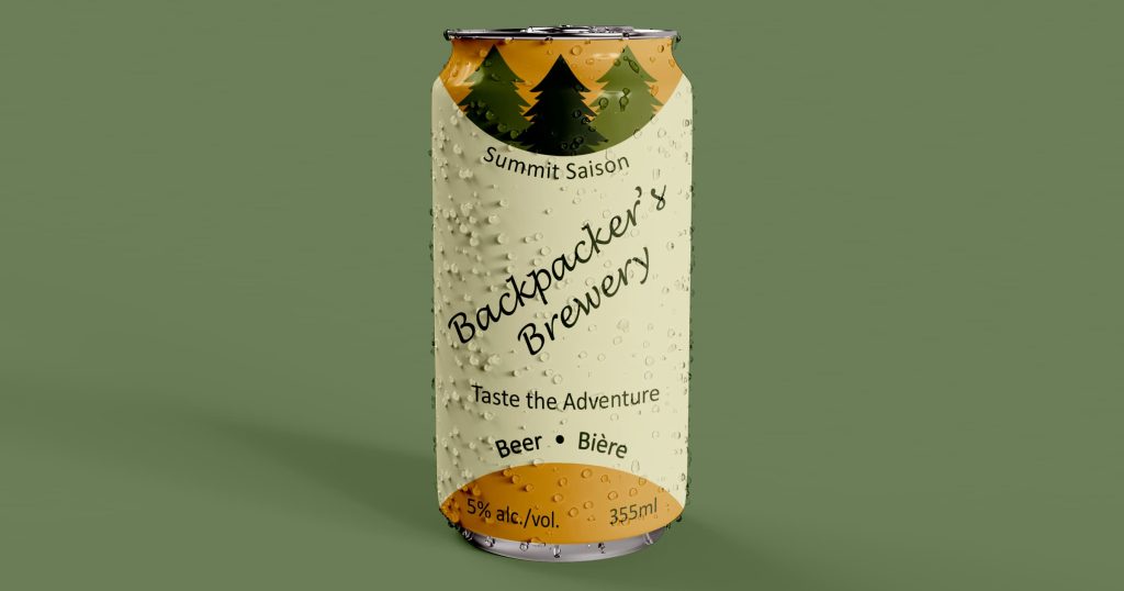
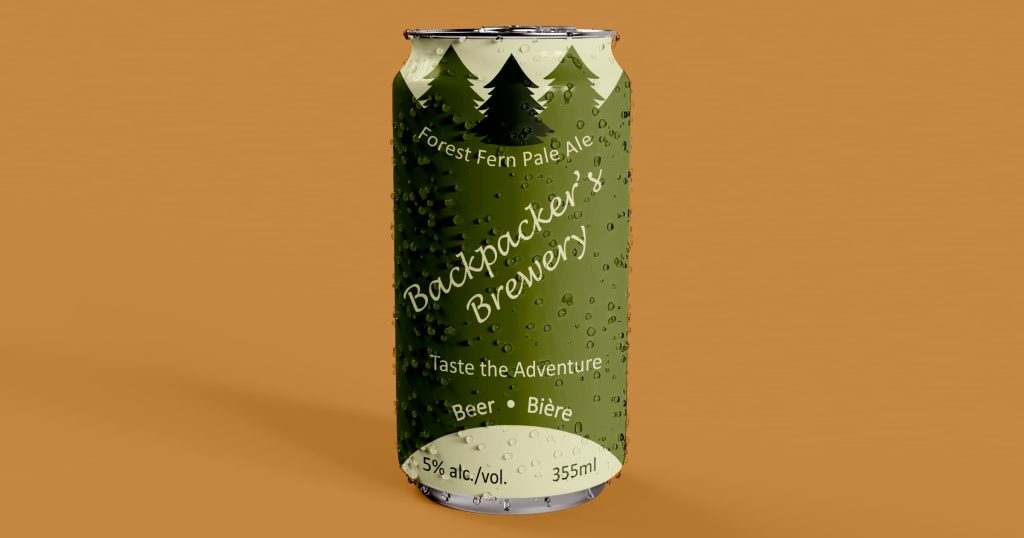
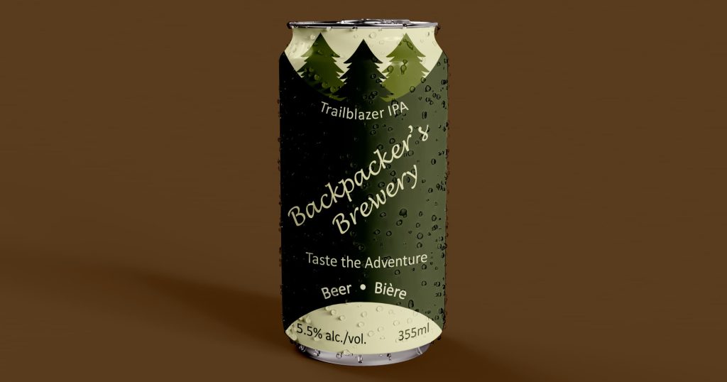
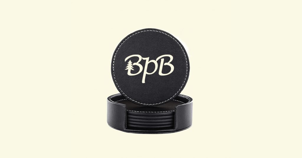
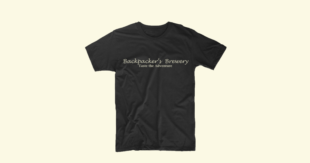
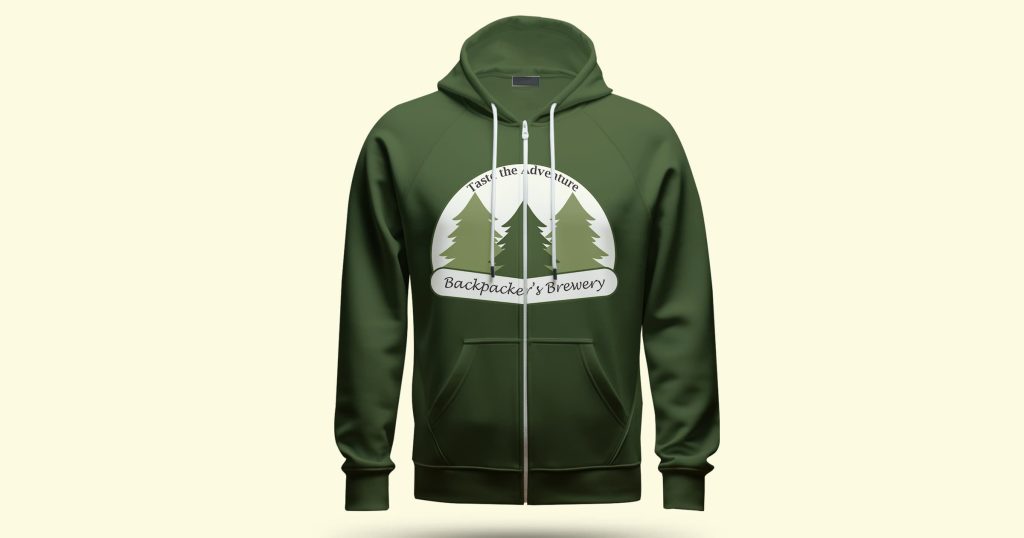
I created a few assets that would be sold in the store on the Backpacker’s Brewery website. My goal for these assets was to create items that highlighted the color scheme and logo of Backpacker’s Brewery, while also using items that would appeal to the customers visiting Backpacker’s Brewery.

Website
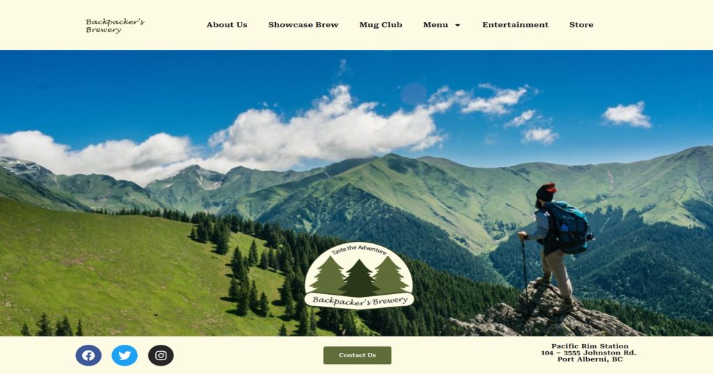
When I started to plan my project for Backpacker’s Brewery, I realized that the website would need to achieve 3 main goals: it needed to serve as a hub for information about the brewery, describe the unique experience offered to its patrons, and offer an online store where customers could order Backpacker’s Brewery merchandise. Developed using WordPress and Elementor Pro, the Backpacker’s Brewery website features a menu with images and descriptions, event promotion on the entertainment page, and customer support through the contact form. The website was designed to be easy to navigate, accessible to all users, and responsive to ensure an optimal viewing and interaction experience across a wide range of devices and screen sizes.
