Oh Fig!
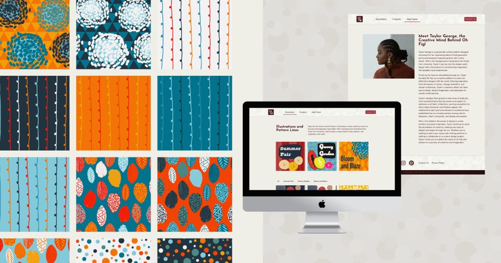
Elementor is utilized as the primary tool for this capstone project. The project begins with developing a mood board, wireframes using Adobe XD, and a comprehensive case study to define the parameters of the fictional client, Oh Fig!, a business-to-business surface pattern design company needing a portfolio website. Three distinct pattern lines are crafted using Adobe Illustrator, focusing on vibrant and engaging designs.
The product mockups are created to enhance visual representation and functionality. Through meticulous planning and execution, the project demonstrates a seamless integration of design elements and client-focused solutions. This approach ensures the website meets the needs of Oh Fig!
Check out the project online.
Moodboard

For the Oh Fig! project, I wanted to create a retro-inspired vibe through the mood board. Warm, summery tones were chosen to infuse the mood board with vibrancy and nostalgia, reflecting the brand’s aesthetic.
With each image, I aimed to balance nature-inspired elements and structured geometrics, setting the tone for the project. This was the guiding inspiration for the subsequent stages of the design process, ensuring that every aspect of the Oh Fig! website remained true to its retro-inspired aesthetic.
Branding
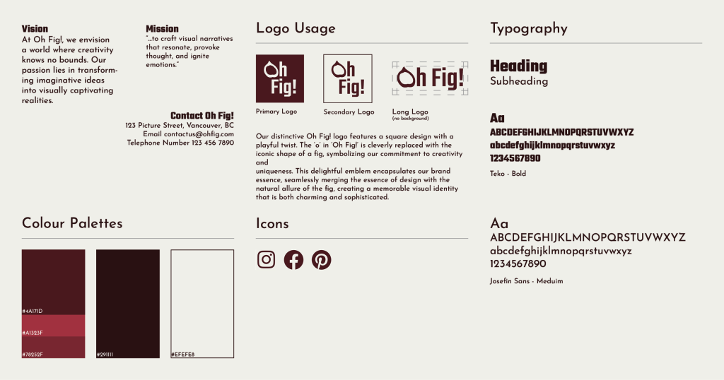
In developing the branding for Oh Fig!, I sought to create a visual identity that would reflect the brand’s creative and unique charm. Central to this endeavour was creating a distinctive logo that would serve as the cornerstone of Oh Fig!’s brand identity.
Drawing inspiration from the brand name itself, I envisioned incorporating a fig into the logo design to add a playful yet sophisticated touch. After experimenting with various iterations in Illustrator, I settled on a design where the letter “O” in “Oh Fig!” was cleverly replaced with the iconic shape of a fig. This twist pays homage to the brand name and symbolizes Oh Fig!’s commitment to creativity and individuality.
In addition to the logo, I simplified the colour palette for Oh Fig!’s branding to complement the vibrant and diverse content featured on the website. By opting for a more restrained colour scheme, I ensured the branding design would provide a cohesive backdrop for the colourful illustrations and pattern designs showcased on the website.
Illustrations
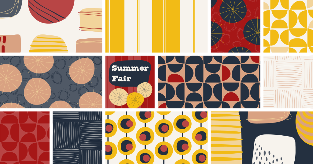
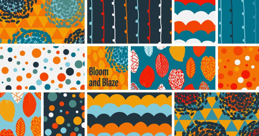
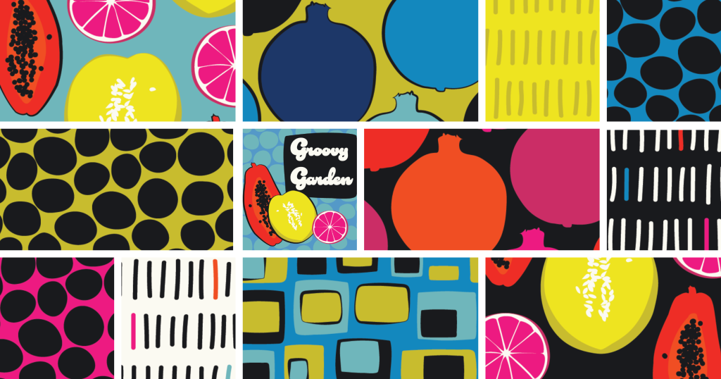
I combined digital sketching with vector design techniques for the illustrations featured in Oh Fig!’s pattern lines. I sketched out the foundational elements of many of the designs using Adobe Fresco, capturing the essence of the retro-inspired aesthetic that defines Oh Fig!’s brand identity. From whimsical fruit motifs to bold geometric shapes, each illustration was infused with vibrant energy and playful charm.
Once the sketches were complete, I transitioned to Adobe Illustrator to refine and finalize the designs. I crafted each illustration, paying close attention to detail and composition. This process allowed me to achieve crisp, clean lines and vibrant colours, ensuring that the final designs would translate seamlessly into repeat patterns for use across various applications.
Product Mockups
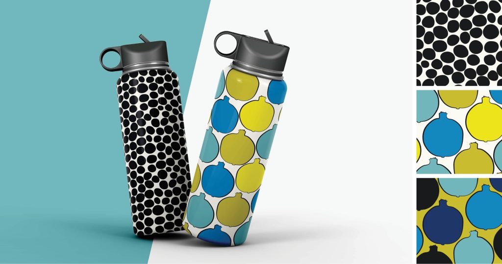

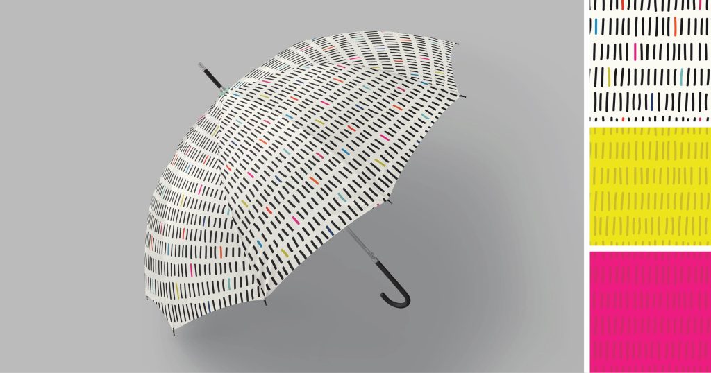
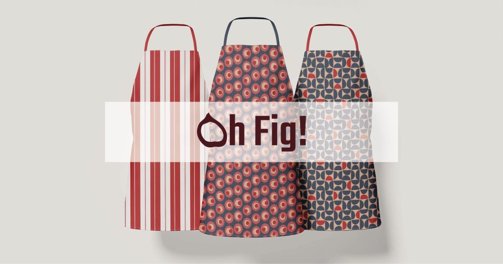
To bring the Oh Fig! patterns to life and visually represent their versatility, I utilized product mockup templates in Adobe Photoshop. Taking my meticulously crafted illustration images, I seamlessly integrated them into pre-made mockup files to showcase how the patterns would appear on various products, from water bottles to phone cases and aprons.
By presenting the patterns in context through product mockups, I aimed to highlight their aesthetic qualities and demonstrate their potential for real-world application across a diverse range of products. This approach adds depth and dimension to the design presentation and allows viewers to envision themselves incorporating the Oh Fig! patterns into their lives.
Website
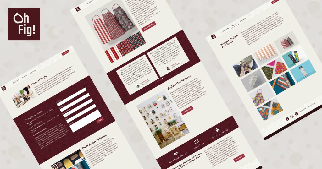
During the development of the Oh Fig! website, my initial wireframes and vision proved overly ambitious due to the limitations of Elementor and available plugins. This realization prompted me to simplify the website’s design and functionality to meet project constraints effectively.
Using wireframes, I crafted in Adobe XD as a blueprint, I refined the layout, design elements, and functionality within Elementor. I integrated strategic call-to-action buttons throughout the site to guide user engagement and interaction, particularly on the homepage and contact page.
To optimize user experience and performance, I implemented a scroll-loading feature on illustration and product pages. This dynamic loading approach minimizes wait times, enhancing overall site responsiveness.
To boost visibility and SEO, I integrated plugins like Yoast to optimize searchability and organic traffic. Rigorous quality assurance tests ensured the website’s compatibility across browsers and devices, maintaining accessibility standards and delivering a seamless user experience for all visitors.
