Iron Sanctuary
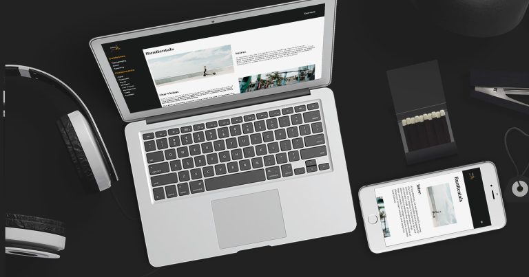
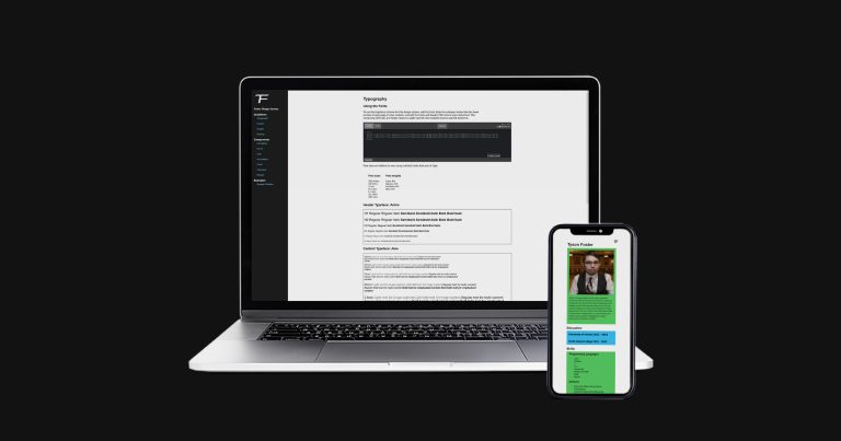
My design system is a versatile and scalable design system that caters to the needs of every client, helping streamline their web development process and create consistent user experiences. The system features a visually appealing theme with a bold and modern look, utilizing red, black, and alice blue colors that align with the client’s branding and visual aesthetics. It offers a comprehensive set of customizable UI components, typography, and design guidelines to match each client’s unique brand identity. The demo site showcases the design system’s capabilities through visually appealing web pages with seamless interactions and responsive layouts, accompanied by documentation for easy implementation. Overall, it successfully meets the client’s requirements for a flexible and visually appealing design language, with the demo site serving as a showcase for its capabilities.
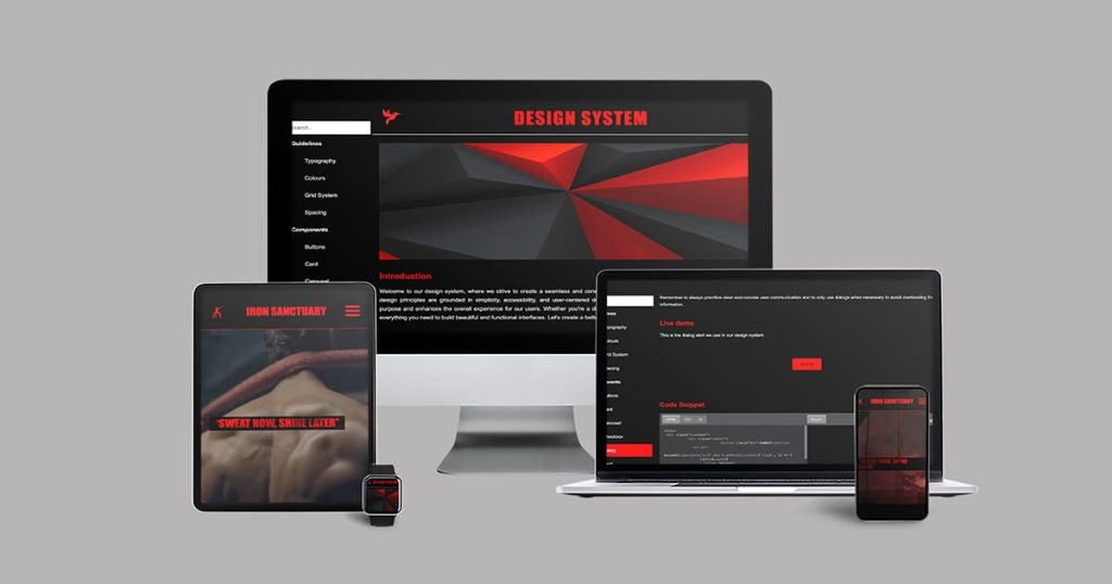
Check out the design system and the demo site.
Conceptualization + Inspiration
As someone who is passionate about fitness, I had always wanted to create a website that would inspire others to pursue their fitness goals. When the opportunity presented itself, I jumped at the chance to make my vision a reality. I decided to name the website IRON SANCTUARY where “iron” represents strength and toughness, while “sanctuary” implies a place of refuge and protection.
Planning
I started by creating a mood board for the website, which included only three colors: black, red, and aliceblue. Black was the primary color, making up 60% of the color scheme, with red and aliceblue taking up 30% and 10%, respectively. With the mood board in place, I proceeded to create a complete design system website from scratch, incorporating the colors from the mood board.

I created sitemaps for both the design system and fitness website.
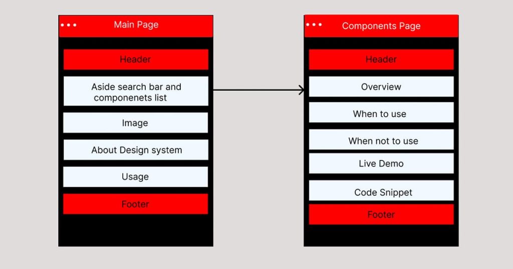

I created low-fi wireframes for the design system and for the fitness website, which included a home page, classes page, gallery page, trainers page, and contact page. However, I decided to focus only on the contact page and home page for the time being.
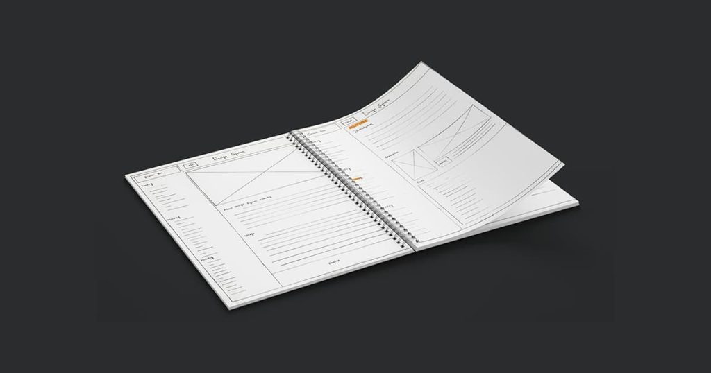

Production
For the design system, I created a logo from scratch and developed all necessary components using HTML, CSS, and JavaScript, ensuring that they matched the colors from the mood board. Once the design system was in place, I started working on the fitness website itself by using HTML, CSS, and JavaScript to build it from scratch, ensuring that it was based on the design system I had created.
To create the website, I followed a task list that included the following steps:
- Created the homepage, incorporating elements from the design system such as the various components, color scheme, and font choices. This included the use of black and red for the header and footer, as well as aliceblue for the main content area.
- Developed the contact page, making sure it was easy to use and included all necessary information.
- Incorporated engaging graphics and images throughout the website to highlight the gym’s facilities, services, and classes.
- Designed the website’s navigation and footer to ensure that users could easily find what they were looking for and access key information.
- Conducted regular tests and made necessary tweaks to improve the website’s user experience and functionality.


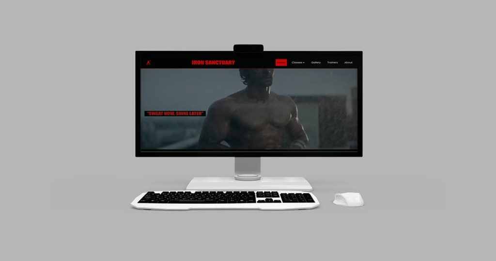
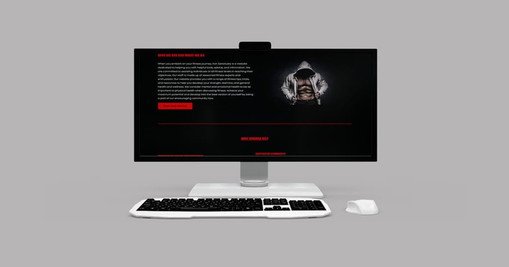
Overall, the process of creating the Iron Sanctuary website involved careful planning, attention to detail, and a commitment to creating a website that would inspire and motivate others to pursue their fitness goals.
Check out the GitHub repository.
