Hair With Flair
The ‘Hair with Flair’ unisex salon is a fictitious establishment located in the heart of Victoria, offering a wide range of hair grooming services to customers. The salon’s services include cuts, color, styling, and other hair treatments. The salon also sells hair care products to customers.

The purpose of a design system for a hair salon is to provide a consistent visual identity and user experience across all touchpoints, including the salon’s website, social media profiles, printed materials, and in-person experience. By using consistent colors, typography, and design elements, a design system can help to establish a strong brand identity and create a cohesive and memorable experience for customers.
Check out the design system and the demo site.
Mood Board
For my project’s mood board, I’ve selected visual elements that work together to create an elegant ambiance for my hair salon’s website.

Colours
I selected a light gray (#f4f4f4) and dark red (#A01313) color scheme as the central part of my design system.
I chose the light gray color because it provides a clean and modern look that is perfect for a hair salon’s website. It serves as a neutral backdrop that can be used to showcase various design elements and images of hairstyles. As for the dark red shade, I wanted to add a touch of boldness and elegance to my design. It’s a sophisticated color that can be used to draw attention to important information or calls to action.
My aim was to create a contrast between the light and dark elements of the website’s design, which helps to create visual interest and hierarchy. For instance, I plan to use the light gray color for the background and large areas of the website, while the dark red will be reserved for headings, buttons, and other smaller elements.
By consistently using these colors throughout my website’s design, I’m confident that my hair salon’s brand will have a recognizable and cohesive look that helps to create a memorable user experience.
Typography
I understand that typography is a crucial aspect of the design system, so I chose a sans-serif font like Josefin Sans, which is easy to read on a screen and has a modern and clean look.

Design System Wireframes
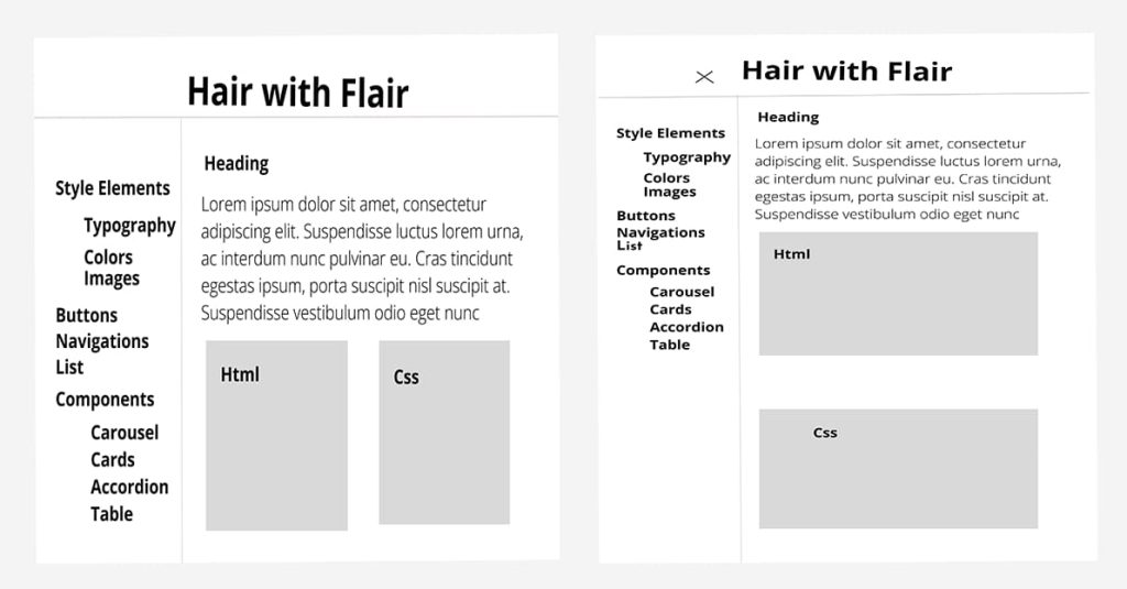
I created a visual representation of how different elements will be arranged on each page of my design system. I’ve made sure to incorporate consistent colors and typography that match the mood board.
My wireframe also includes easy-to-read input forms and lists. I’ve also made use of components like cards, carousels, accordions, tables, and sections to organize and present information in a clear and visually appealing way. To ensure that these components were responsive and worked well across different devices, I planned to code them using React.js, HTML, and CSS.
Overall, my wireframe provides a clear and detailed plan for my website’s design system, including the layout, colors, typography, images, patterns, and components. I intend to use this as a blueprint for my website’s development, guiding the design process and ensuring that the final product meets the client’s needs and expectations.
Design System Website
For my project’s design system, I decided to use React, a popular JavaScript library for building user interfaces. I conducted research and followed tutorials to install Node.js and npm packages, which allowed me to set up the development environment. Once the environment was ready, I created a basic default React template to work with.
To make the app suitable for my project, I modified it to become a sidebar app that includes all necessary navigations and submenus for users to navigate the website. The sidebar was designed to expand and collapse as needed, providing easy access to all main navigation options.
Overall, I built my design system using React and created a sidebar app with all necessary navigations and submenus. Additionally, I maintained a consistent page structure and utilized a card structure for displaying the code.

Demo Site Wireframes
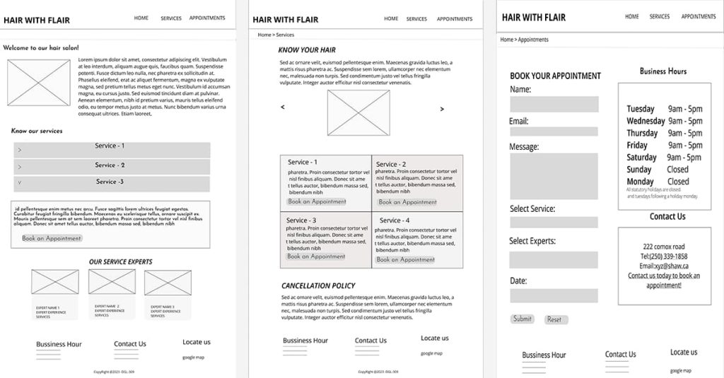
In this project, I designed wireframes for the hair salon website layout, incorporating elements selected in the design system. I planned the website to consist of three pages, each with the same header and footer.

Demo Site
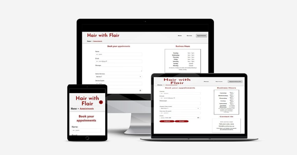
In this project, I built a responsive website for Hair with Flair, a hair salon, using React.js. I developed the website based on the wireframes and design system that I created earlier.
The website features a navigation page in the header, including menus and breadcrumbs for easy navigation. The footer includes a short heading of the salon’s services, contact details, and business hours.
For the website header, I included the website title, menus, and breadcrumbs for easy navigation. In the footer, I added a short heading of the salon’s services, contact details, and business hours.
On the home page, I provided a small introduction to the salon, followed by a brief description of their services and details about their expert staff.
For the services page, I created a detailed list of hair care services offered by the salon, along with a button to book an appointment and information on cancellation policies.
On the appointment page, I designed an application form for booking appointments, along with contact details and the salon’s business hours.
I specifically designed the wireframes for mobile view to ensure that the website is accessible and easy to navigate on mobile devices.
I designed the website with brand recognition in mind and ensured that every page was responsive, making it accessible and easy to navigate on all devices. Overall, the website provides a seamless user experience, with consistency between the design system and the hair salon website.

Testing
I have done testing in two different browsers and assessed their performance using Pagespeed and Gmetrix. Additionally, I validated the code using Eslint and successfully resolved nearly all of the console errors. Finally, I conducted thorough accessibility testing to ensure that the website is easily accessible to all users.

Overall, the hair salon website built in this project provides a seamless user experience, with consistency between the design system and the website and has brand recognition.
