Daydream Studio
Daydream Studio is a creative graphic design studio that specializes in branding and illustration. This project was a full brand conceptualization from scratch for Daydream Studio. They need a recognizable identity system that would create a strong brand presence to captivate their audience.
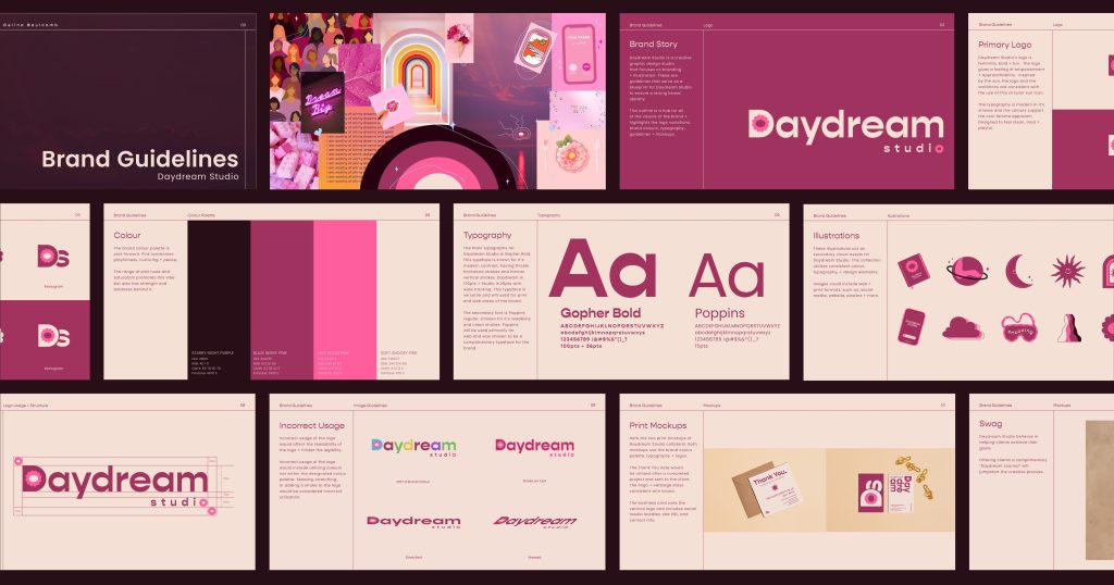
To refine the brand visualization, a style guide features a logo suite, colour story, typography, illustrations, guidelines, brand collateral, swag, and a digital campaign. To tie it all together, a landing page is included to bring the ad campaign to life. Each piece of the project builds upon each other, and throughout, you will see a consistent usage of all brand assets.
Check out the full Daydream Studio brand guidelines.
Moodboard
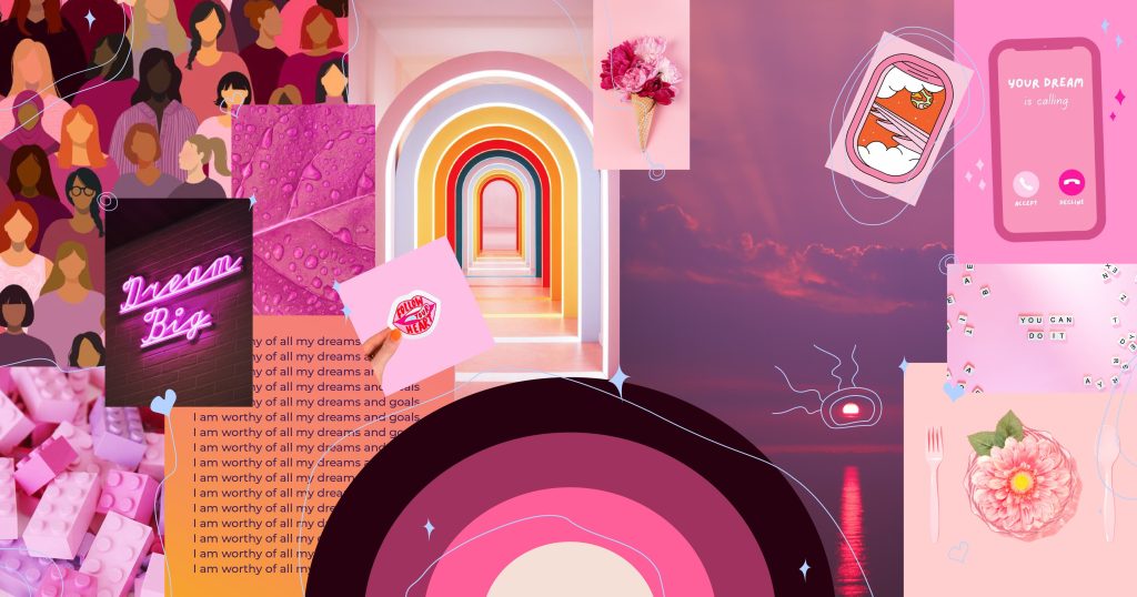
To begin this project, I created a moodboard to define the creative direction and mood of the brand. This allowed me to collect my thoughts and ideas in one place and was utilized as a foundation for developing the tone of the brand. You’ll see a collection of curated images, colours, quotes, and thin illustration elements that helped me to communicate the visual concept of Daydream Studio.
Primary Logo
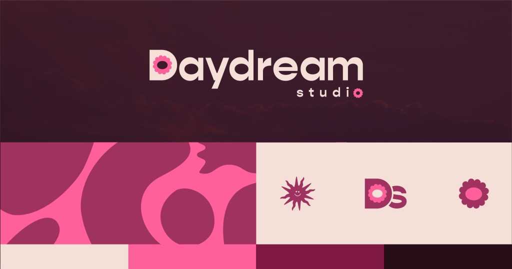
The logo I created is an extension of the moodboard. The process began with pen and paper sketches. I was really inspired by the ultra feminine and empowering messaging created from the moodboard and I wanted that to reflect in the logo.
I designed the custom flower icon and I felt that it was a delightful visual representation for the brand. I utilized this icon twice in the primary logo and throughout the logo variations. By adding two flower icons, it gave the logo balance, and a strong visual for the brand identity.
The typography is “Gopher” in bold. The spacing in “Daydream” is bold, tight and clean, whereas “studio” has a much larger tracking giving it space, and airiness. The words in the logo follow a classic sentence case format, to keep it clean and professional.
Logo Variations
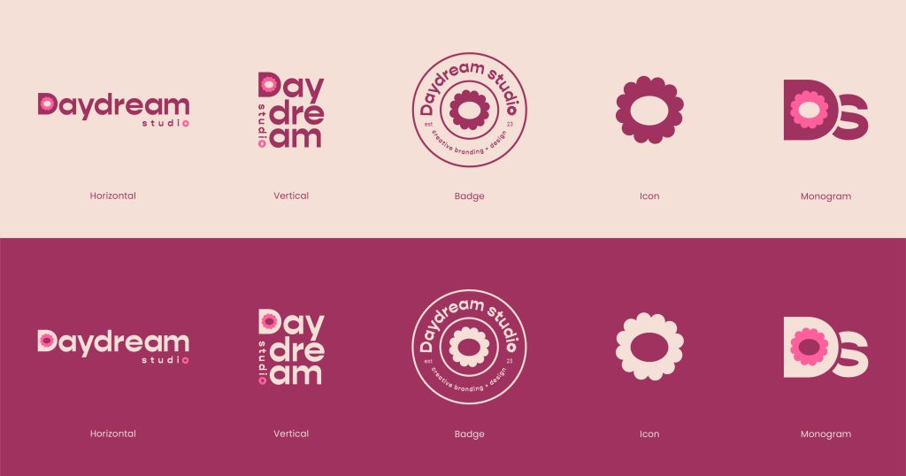
The logo variations went through many stages of revisions. Throughout my logo suite, I wanted to have a clean primary, vertical, badge, icon, and a monogram version for all of the logo variations. Keeping the logos consistent between all variations was a challenge. Originally, I had designed a second icon that I was using throughout the suite. But with a lot of contemplation, I found that by removing it, and instead, using the flower icon as the primary visual element, gave the design a much stronger impact.
Colour + Typography
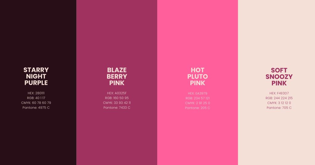
The colours chosen are playful and bold. They match the visual concept of Daydream Studio. I chose to lean into the feminine approach of the brand and highlight that using a range of pink hues. The pinks range from dark to light and can be used in various formats while maintaining good contrast. I used the range of pinks in a way to draw attention to certain areas, while staying consistent in the design overall.
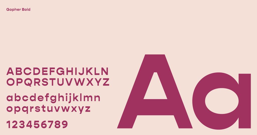
The typography is “Gopher” Bold, which is a sans-serif typeface known for its modern strokes and versatility. The typography choice was very important, and I knew I wanted one that was contemporary and adaptable. “Gopher” in Bold was the perfect match and typeface for the logo.
Illustrations
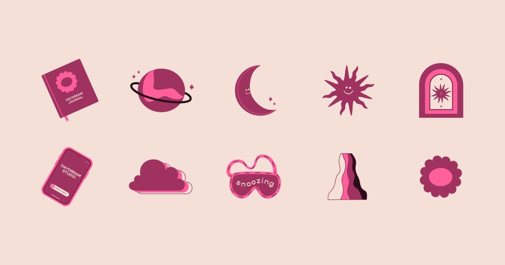
I created a series of illustrations for the brand to use as an extension of the personality of Daydream Studio. These illustrations can be used in web and print formats as a playful and fun visual asset. I created the series and utilized a consistent theme that follows the brand’s colour story and typography. The illustrations have similar shapes and weights, and I reused elements throughout the series to create unity.
Brand Collateral
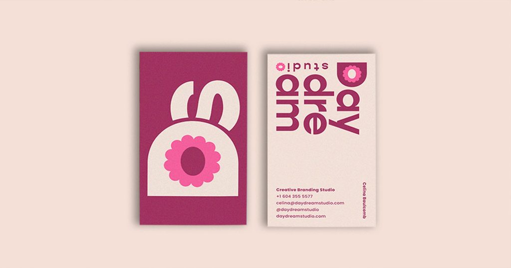
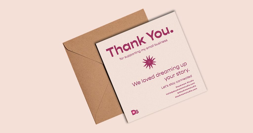
I designed two pieces of brand collateral to be used for the Daydream Studio brand. Both pieces align with the business’s needs. First, is a business card which features the brand’s vertical, and monogram logo. Then, I designed a Thank-You note for clients. This was an opportunity to personalize the brand and build a lasting impression when working with clients. Both pieces are consistent with the use of colours, typography, logos, verbiage, and design elements.
Swag
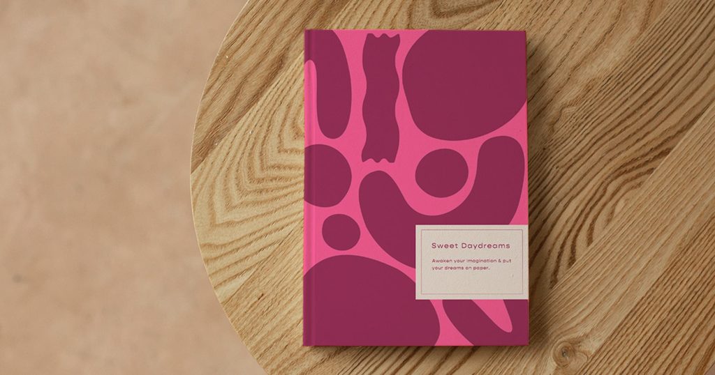
I designed this notebook for Daydream Studio to boost engagement and build strong relationships with clients. To jumpstart the creative process, Daydream Studio would offer their clients this notebook to help them to reach their goals. I created the notebook by creating these organic shapes that reflect the brand. The notebook is consistent with the brand’s values and aligned as a visual representation.
Social Media Campaign
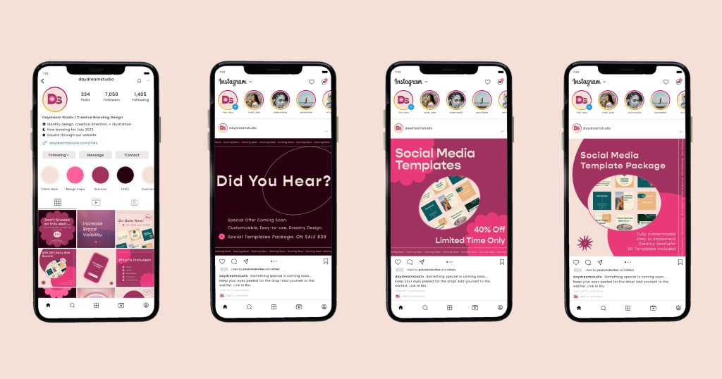
This project includes a social media campaign for Daydream Studio. The campaign is 2 weeks long, and features a special price for a product launch. The product is dreamy social media Instagram templates, designed to help take your Instagram to the next level. The social media campaign is released on Instagram and is published as 3 carousel posts. The campaign features the Daydream Studio aesthetic and is consistent with colours, typography, verbiage, and design elements.
Landing Page
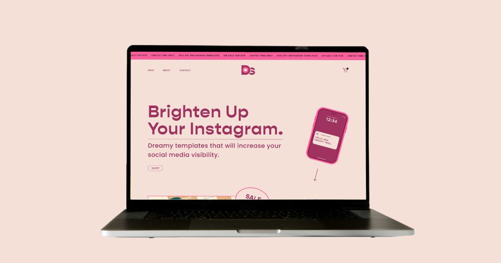
To complete the campaign, I designed a landing page for customers to purchase the Instagram templates. The landing page is consistent and true to the Daydream Studio brand and aesthetic. The landing page is a fun way to utilize all of the brand’s elements and create a digital prototype to sell the campaign products. The landing page is built using brand elements such as logos and illustrations and you can really see the brand come to life.
Check out the landing page XD prototype.
